The Shipley Art Gallery is currently celebrating its centenary and as part of the Centenary Exhibition some of the star objects have been displayed.
I was asked to examine the painting by Joachim Wtewael called The Temptation of Adam and Eve. It was interesting to do a bit of research and and use my conservation knowledge to do something other than treat a painting. Here is what I found out.
About the artist
Wtewael was born in Utrecht and was trained there by Joos de Beer. He then spent four years in Italy and France, returning to Utrecht in about 1590. He remained active there until his death, becoming a wealthy flax merchant as well as a famous painter. He was first introduced to the Mannerist style at the court of Fontainebleau in France, and, like other Haarlem artists, was influenced by Bartolomeus Spranger, a native of Antwerp who had become court painter to Emperor Rudolf II in Prague.
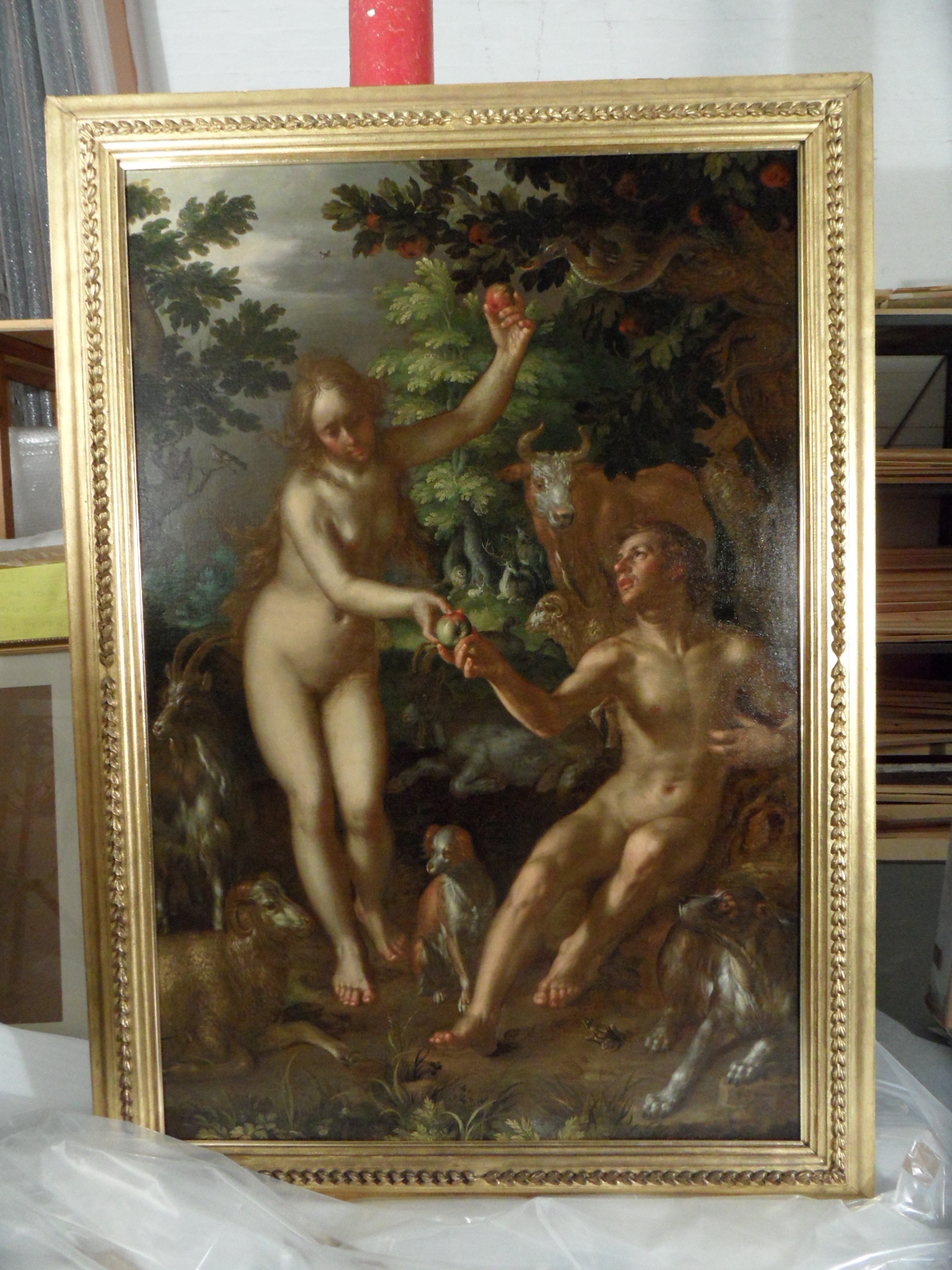
G1184 The Temptation of Adam and Eve, full front in reflected light
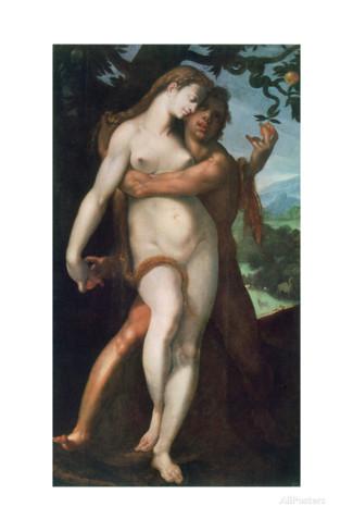 This painting is of the same subject entitled Fall of Man by Bartomeus Spranger who was Wtewael’s tutor.
Wtewael was one of the main exponents of the Mannerist style in Holland in the early 17th century. He remained largely unaffected by the new naturalism of Caravaggio and his followers were introduced to the north by artists like Ter Brugghen; Wtewael’s work did, however, include a number of portraits.[1]
Mannerism in the North[2]
The style of painting and drawing practised by artists in Northern Europe during the early part of the 16th century (ca. 1500–1530) has come to be known as Mannerism. Distinct from the Mannerist period in Italy, which began slightly later and lasted until the 17th century, Northern Mannerism in the early 16th century is characterised by unique stylistic and thematic traits, a number of which derive from late Gothic art. Although many of the early 16th century Mannerists were based in Antwerp, where the movement was most clearly defined, other centres in France, Germany, and the southern and northern Netherlands (i.e., present-day Belgium and Holland, respectively) were important for the transmission and divergence of the style.
Antwerp’s central place in this movement, which has led to the creation of the sub-term “Antwerp Mannerism,” can be linked to its emergence as the economic capital of Northern Europe at the beginning of the 16th century. Bolstered by its rich trade and cultural contacts, the port city of Antwerp attracted hundreds of artists, many of them from northern France, the Rhineland, and especially Holland who joined the local painters’ Guild of Saint Luke, established large painting and sculpture workshops, and fed an expanding market for the production and export of art. Though stylistic traits differed from artist to artist, some defining features of Antwerp Mannerist painting are dramatic gestures and figural arrangements: lavish costumes; vivid, sometimes abrasive colouristic effects; imaginative architecture that freely combines Gothic and Renaissance elements; and demonstrative technical virtuosity.
As a movement, this branch of Northern Mannerism was relatively short-lived, dying out by the fourth decade of the 1500s, but it was echoed in some of the trends explored by Netherlandish artists around the turn of the following century.
Material in the 16th century
Canvas
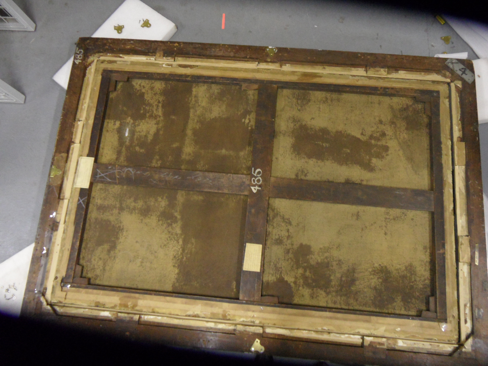
Secondary support (stretcher) • The canvas is attached to a large Square (bute) jointed stretcher with a solid horizontal crossbar and a two-part vertical crossbar. This is unlikely to be original to the painting as expanding stretchers as canvas supports were not used before the 18th c • All of the keys are present and tied in • The stretcher has been expanded by about 4 mm on each corner • It’s in good condition with only a slight bowing on the two verticals • There are two exhibition labels attached to the stretcher bars one for the Royal Academy in London for the winter exhibition of 1962 and another one for the Graves Art Gallery Sheffield for an exhibition of Dutch masterpieces in 1956 • On the back board there is a second exhibition label from the National Gallery for an exhibition called Paradise which was more recent • The Shipley Art Gallery is chalked on the central bar with what is possibly an old accession number 485 (also written on the frame) Canvas • The original canvas is a medium weave which has been lined on to a fine close weave canvas with a wax resin lining • None of the original turnover edges remain • There is considerable bleed through in patches on the back of the lined canvas indicating that it was hand lined. See photo • There are splash marks on the back of canvas on the left-hand side • There are dark spots on the back of the canvas particularly noticeable in the lower section indicating that the canvas has probably been damp at some points with possible mould growth • There is a small repair visible on the back of the canvas in the top right hand quadrant which corresponds to a slight indent on the front of the painting • The canvas is attached to the stretcher with rusted iron tacks and brown gummed tape.
Wtewael has used a large canvas for this painting. It was however more usual to use wooden panels as a support in northern art. As a flax seller, he would be more open to the use of linen as a support as linen is made of spun flax.
Canvas took over from panel in Italy by the first half of the 16th century, a change led by Mantegna and the artists of Venice (which made the finest canvas at this point, for sails). In the Netherlands the change took about a century longer, and panel paintings remained common. One of the most outstanding differences between modern painting techniques and those of the Flemish and Dutch Masters is in the preparation of the canvas. “Modern” techniques take advantage of both the canvas texture as well as those of the paint itself. Renaissance masters took extreme measures to ensure that none of the texture of the canvas came through. This required a painstaking, months-long process of layering the raw canvas with (usually) lead-white paint, then polishing the surface, and then repeating.[5] The final product had little resemblance to fabric, but instead had a glossy, enamel-like finish.
Ground layers
Traditionally, the canvas was coated with a layer of animal glue (modern painters will use rabbit skin glue) as the size and primed with lead white paint, sometimes with added chalk. Panels were prepared with a gesso, a mixture of glue and chalk.
Ground
Ground is a coating material applied to a support, such as canvas or panel, to make it ready for painting. Grounding, or priming as it is also called today, must produce a smooth surface that can be easily painted upon. It must be hard but not brittle (which causes cracking) and it must be porous enough to allow the oil paint to adhere permanently but not too absorbent as to suck out the oil from the layers of oil paint and cause it to detach. If oil paint is applied directly to canvas with no ground, paint soaks into and spreads on the support. Furthermore, the fabrics of the support is eroded by the acid of oil. Painters generally first sealed the canvas before grounding with a layer of animal skin glue or casein called “size.”
Dutch painters generally used the double ground, a ground prepared with two different layers material. Double grounds spread from the northern Netherlands and Flanders to France, England and Scandinavia. In the Netherlands they were more frequent in Utrecht and Amsterdam than in Haarlem, where they never caught on, and light or whitish grounds remained popular much longer. The pigmentation of lower grounds varied, even within the oeuvre of a single painter. Double grounds in the northern Netherlands often consisted of chalk or ochre (red or yellow) which were subsequently covered with a thin coat of light grey producing the so-called Raleigh scattering effect. Artists sometimes scraped up the residue paint that deposited at the bottom of the receptacle which held turpentine for cleaning brushes to use as a cheap alternative to more costly pigments.
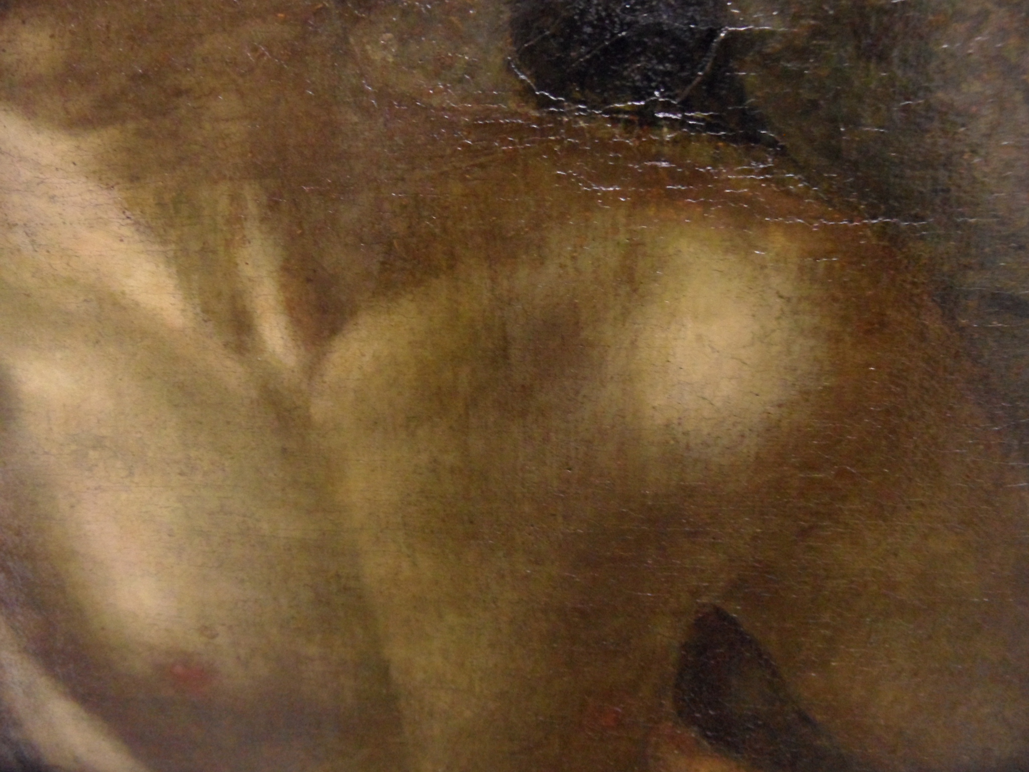
If you look closely at the chest of Adam you can just make out the greenish grey under painting in the shadowed areas
Mediums
Traditionally, artists mixed their own paints from raw pigments that they often ground themselves and a medium.
Early Netherlandish painting in the 15th century was the first to make oil the usual painting medium, and explore the use of layers and glazes, followed by the rest of Northern Europe, and only then Italy.
Pigments in the 17th c[3]
Some pigments were natural minerals: the expensive blues, ultramarine and azurite, green malachite, and the relatively cheap red and yellow earths and chalk. Lead white, red lead and Verdigris had been manufactured since Classical times. Montpellier was renowned for the production of Verdigris and good vermilion was made in Antwerp. The manufacture of lead-tin yellow (‘type I’) was linked with the production of ceramic glazes and that of smalt with the glass industry;
Rembrandt used lead white in flesh tones, white cuffs, and collars and lead tin yellow in highlights.
Dutch vermilion, produced by the direct combination of mercury and sulphur with heat followed by sublimation, was highly developed in the time of Rembrandt. He typically preferred to use bright red ochre heightened by the addition of red lake rather than vermilion, which he used only occasionally.
The lake pigments (produced from textile dyes fixed to a precipitate formed with alum and potash or to a chalk substrate) typically used in oil painting to produce effects of richness and depth over opaque under layers, were rarely used for this purpose by Rembrandt, who typically mixed lakes directly with other pigments to enrich their colour.
Ochre’s stability, range of colour, and range of translucency to opacity suited Rembrandt’s purposes well and therefore tended to predominate in most of his paintings. In addition to iron oxide, umber contains black manganese dioxide that has a siccative effect on linseed oil. Therefore, they were added by Rembrandt to the ground layers to promote faster drying.
Vandyke brown was often used by Rembrandt for his initial monochromatic sketching of a composition and for deep brown background glazes. It is a very poor dryer, hence Rembrandt always mixed it with other earth pigments to avoid this defect.
Smalt was popular because of its low cost. Its manufacture became a specialty of the Dutch and Flemish in the 17th century. Smalt is a very good dryer and was used by Rembrandt for this purpose and also to give bulk to thick glazes containing lake pigments, which are poor dryers.
Verditer, a synthetic azurite, was available in the 17th century and has been found in some of Rembrandt’s paintings. Azurite appears more frequently in Rembrandt’s early work. In the later pictures, Rembrandt used smalt for blues. Azurite is a good dryer because it contains copper that has a siccative effect on linseed oil. Rembrandt therefore often added azurite to pigments that were poor dryers.
Bone black is considered the deepest black of all and was used extensively by Rembrandt in the sketchy under layers of his paintings and for the deep black of the costumes worn by his sitters.
Rembrandt used carbon black primarily as a grey tinting pigment in the upper ground layer on his canvas paintings, which occasionally can be visible as the cool half tones in flesh areas.
Chart of Pigments and their availability
Note almost half of the pigments that we use today are unavailable until the beginning of the 18th century.
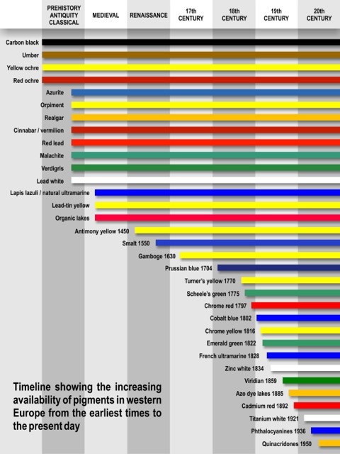
Above taken from-/thebookandpapergathering.org/2014/07/03/review-making-and-colouring-the-medieval-book-a-lecture-by-dr-brian-h-davies-bsc-phd-cchem-frsc-presented-at-the-freemasons-hall-london-25-march-2014/
Painting Techniques
Most traditional grounds were coloured. Painters were aware that the tone of the ground strongly influences the perception of the tone and hue of the pigments which were applied over it. Thus, the final overall tone of the picture was effected, especially in the shadows where thin layers of transparent paint were generally used. Dark toned canvases greatly aid the rendering of the depiction of shadows but require repeated layers of light-coloured paint to represent the illuminated areas, which unfortunately may alter in time due to the fact that the transparency of some paints, including white-lead which was often used in light passages, augments in time (it becomes see through as it ages).
Dead-colour (dood-verf)[5]
Dead-colour (in Dutch dood-verf), which is the equivalent of today’s term “underpainting,” is a more or less monochrome version of the final painting intended to give volume, suggest substance to form, fix the composition and distribute darks and lights with a good degree of accuracy. The lack of colour used in the term “dead-colour” probably explains the word “dead.” In the 17th century, dead-colouring appears in various forms.
Dead-colouring was once so important in the painting process that it was mandatory in early days of Flemish painting. In 1546, one of the Hertogenbosch guild rules states, “7. item. All painters will be bound to work with good paints, and they will not make any paintings than on good dry oak planks or wainscot, being each colour first dead-coloured and this on a double ground…”
It was not uncommon in the busier 17th century studios that assistants worked up numbers of paintings to the dead-colouring stage that only needed to be finished by the master. Maintaining an abundant stock of images on spec may have been a expedient to entice prospective buyers.
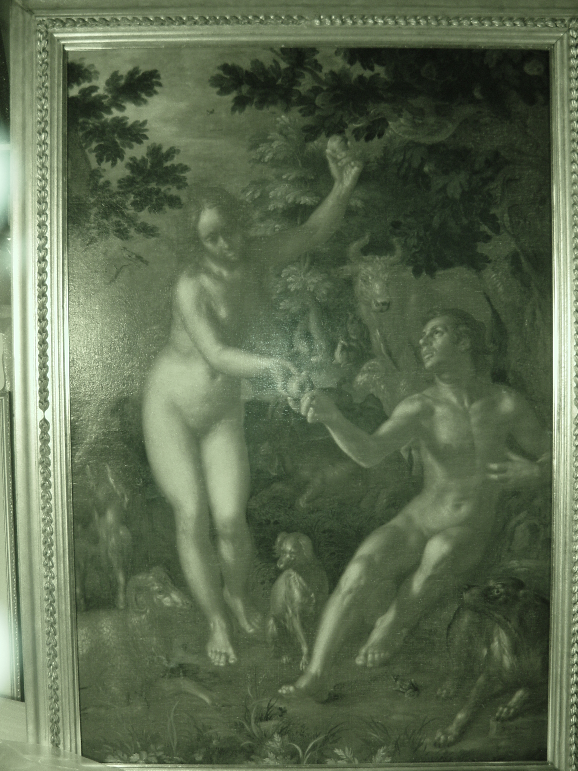
Here we have a photo taken in Infra Red this allows us to look through some of the thin paint layers to see the under painting. You can see how the painting is modelled in quite a lot of detail before adding colour.
In this painting we can see examples of this painting technique so common in the 17th century called ‘The Turbid medium effect. The turbid medium effect in nature can be readily observed when veins close to the skin take on a blue cast. Painters replicate this effect by superimposing a thin (translucent) light layer of paint over a darker one: the layer above appears much cooler than it would have appeared had it been painted over a lighter layer of paint. Light blues skies are particularly airy if the painters superimposes a light blue mixture of paint over tan or light brown ground. The turbid medium effect is greatly amplified if the dark tone underneath is a warm brown such as the priming colour of this canvas. This technique was used extensively in the Dutch golden age of painting to create the cool half tones of human flesh by first modelling the darker shadows in dark browns, mostly umbers. The lighter flesh tone (usually mixture of lead-white and small amounts of vermilion and/or yellow ochre) was applied adjacent to the shadows and then drawn over with a light brush with great finesse tapering off gradually over the darker shadow to indicate the turning of the underlying form. This technique, extraordinarily difficult to master, creates a subtle pearlescent tone. The fresher the paint application, the more pronounced and natural is the result. Repeated stirring and mixing of the paint destroys the effect almost immediately.
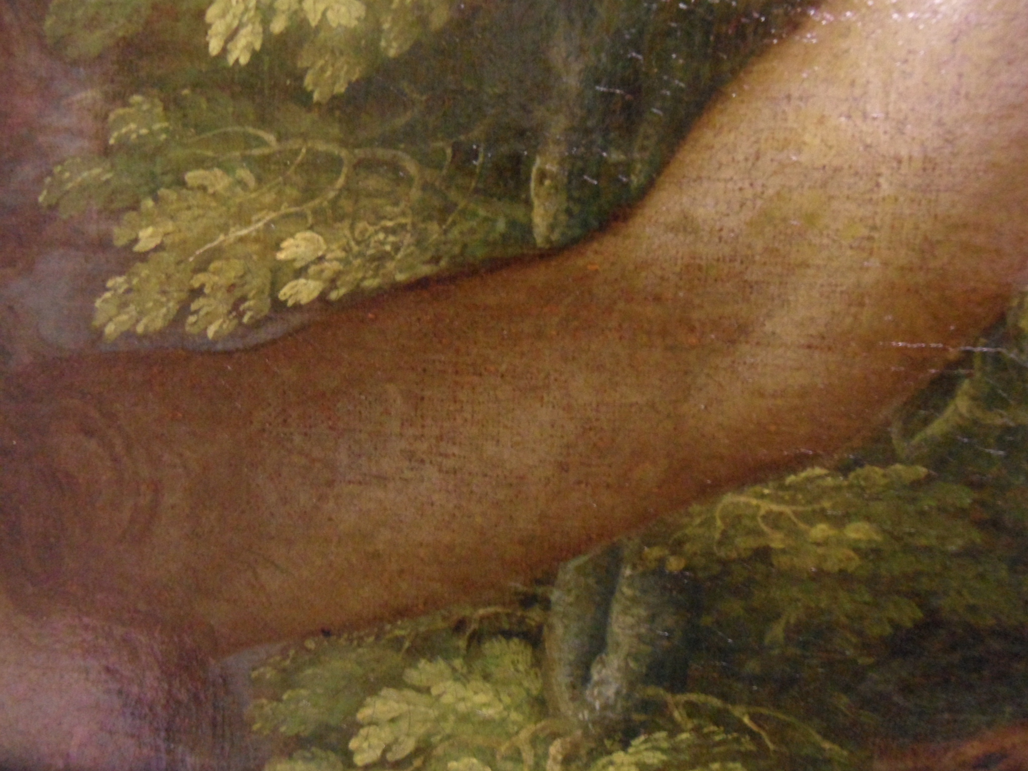
In this close up of Eve’s arm, you can see the thin layer of pale paint has been pulled over the highlights of the shaded arm, making the warm under paint become much cooler in tone.
[1] https://en.wikipedia.org/wiki/Canvas
[2] Jacob Wisse Stern College for Women, Yeshiva University http://www.metmuseum.org/toah/hd/nman/hd_nman.htm
[3] http://www.webexhibits.org/pigments/intro/renaissance.html Rembrandt (1606-1669); the Dutch Golden Age palette
[4] https://en.wikipedia.org/wiki/Canvas
[5] http://www.essentialvermeer.com/glossary/glossary_d_i.html#.WIjV0FOLSUk Taken from – http://www.nationalgallery.org.uk/artists/joachim-wtewael
2 Responses to Would you Adam and Eve it!