‘The Lamentation’: A Winning Formula

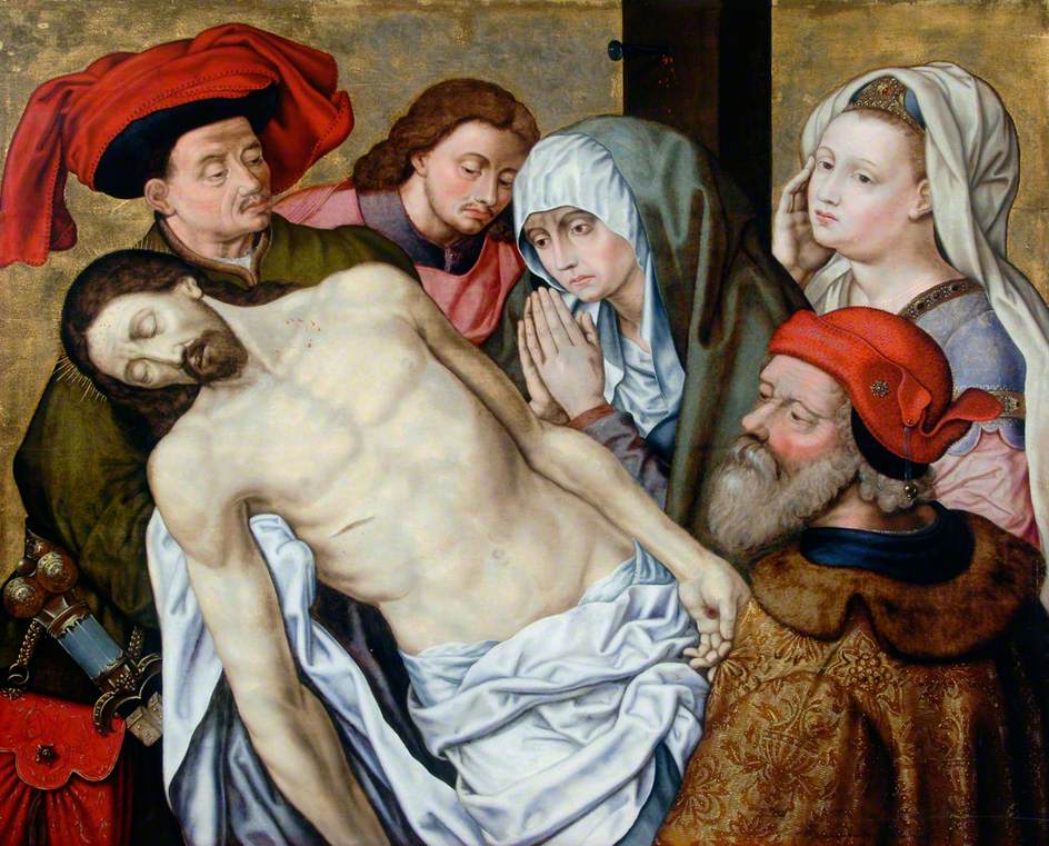
'The Lamentation', after Hugo van der Goes, c. 1560, 137 x 159 cm (Hatton Gallery)

Sometimes if you find a winning formula, there seems little point in changing it. This could be said for certain painting compositions, some of which have been used by artists for hundreds of years. Michelangelo’s Pieta, for example, was so popular that its effect can be seen in painting and sculpture for hundreds of years, still weaving its way into art today.

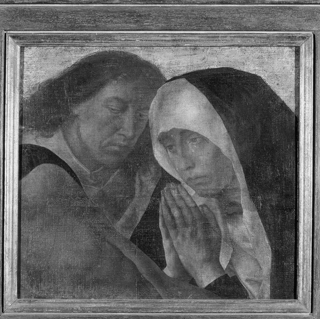
Fragment of 'The Lamentation', Hugo van der Goes, c.1475, oil on panel (Christ Church Oxford)


Demonstrating this devotion to a composition is The Lamentation, an oil painting on panel owned by the Hatton Gallery. Bought for the gallery’s permanent collection in 1957, the design is a copy of a very popular painting by Hugo van der Goes, one of the most successful Netherlandish artists of the 15th century. The Lamentation shows Christ after being taken down from the cross, his body stiff and deathly pale, angled against the upright figures of mourners (including the Virgin Mary, John the Baptist and Mary Magdalene) to create a dynamic design of near-geometric lines and shapes.

The original, painted around 1475, has been destroyed, although what is thought to be a small fragment can be found in Christ Church, Oxford. Out of the many existing versions of van der Goes’ Lamentation, a handful have been recognised as being close to the original, one of which can be found  in the Rijksmuseum, Amsterdam. The Hatton version is likely to have been created over 100 years after the original, most probably by an artist who didn’t see the original composition, and instead worked from one of the many replicas. There are some interesting variations from the original, including Christ’s cross being visible behind the Virgin Mary, and a rich, red velvet bag in the left foreground. The general composition, however, including the positioning and expressions of the figures, remains true to the original. The idea of replicating a painting didn’t once hold the negative connotation that it does today, and the painting plays an important part in demonstrating the continued trend for representing The Lamentation more than a century after the original, also helping to show the subtle changes in design introduced over the years.

Part of the reason van der Goes’ painting was so popular could be because Albrecht Dürer, an important artist from Renaissance Germany, reserved high praise for the painting, recording his sighting of the work in his diary. The painting also tells an interesting tale of religious trickery: Around 1580, when Protestant reformers were storming through churches destroying richly-gilded and extravagant religious effigies typical of Catholicism, it is said that van der Goes’ painting was hastily covered with a layer of removable paint. In order to fool the Protestants, the Ten Commandments were scrawled atop the paint, giving the impression of approved pious simplicity. I like to imagine a gang of protestant reformers striding through a church somewhere in Bruges, nodding in approval at an apparently humble version of the Commandments, whilst secretly a beautiful and rich painting lay hidden underneath the surface.

The Lamentation will be shown as part of the Hatton’s Winter display of Old Master paintings, many of which have been subject to conservation treatment or reframing. The exhibition, called ‘Framing Icons’, opens at the Hatton on 7th December, and runs until 9 February 2013.

JMW Turner’s ‘Dunstanburgh Castle’: poetry, imagination and reality

Not so long ago, I went out to Dunstanburgh, near Alnwick, to see how much of the landscape I could recognise in our watercolour by JMW Turner. Turner was only 22 when he visited in 1797, as part of a tour of northern castles. He was a very imaginative artist, and it’s fascinating to see what inspired him and how he transformed the subject in his painting.

Dunstanburgh Castle was built from 1313 to about 1319 by Thomas, Earl of Lancaster. After leading a revolt against King Edward II (his cousin), Lancaster was executed in 1322. The castle’s link with important and dramatic events in history would have made it an attractive subject for artists and collectors. (Details of the castle’s history can be seen here.)

JMW Turner (1775-1851), ‘Dunstanburgh Castle’, about 1798-1800, Purchased 1982 with grant aid from the Victoria and Albert Museum Purchase Grant Fund, the Friends of the Laing Art Gallery, and the John Wigham Richardson Bequest, G5656


Dunstanburgh Castle, high tide. Click the image to enlarge

Turner showed the castle apparently cut off by sea – a way of expressing its isolated and exposed location. It’s possible to get that kind of view from rocks at high tide, but only if you don’t turn your head too much to the left, when you’d see the curve of the shoreline. The castle walls extend along a long, thin finger of land that sticks out into the sea.

Visiting Dunstanburgh today, the gigantic double-towered gateway and ruined towers are some of the most striking features of the castle. The steep hill and sheer cliff on the far side of castle also make quite an impact. Turner’s watercolour takes liberties with the actual view but in a way that expresses the character of the place.

Turner made only one drawing of the main front of the castle in his 1797 sketchbook, and it’s very similar to the view in the photograph. Turner’s pencil sketch is very faint, so the image has been enhanced to make it a little easier to see. In the sketch, we can see the outline of the dark green bank below the castle – it’s covered in low-growing gorse bushes, and probably hasn’t changed much since Turner’s time.

Dunstanburgh Castle from the South 1797, Tate D00952. Photo: © Tate, London 2012, enhanced image. Click the image to enlarge

The main difference to the photo view is the closeness of the Lilburn Tower (on the left) to the entrance gateway. This has the effect of giving a more unified appearance to the castle front. I don’t think it’s possible to get a view from the shore that shows the Lilburn Tower like this – I’ve tried and failed. So, I think that Turner was already making picture composition choices in the sketch.

I’m pretty sure also that the cottage was a pictorial invention, added to contrast with the ruined grandeur of the castle. The land there is marshy – the remains of a medieval lake that was dug in an arc around the landward sides of the castle – and there’s no evidence of a cottage on the ground.

Dunstanburgh Castle from the hill. Click the image to enlarge

Turner would have needed quite a close view for details he recorded on his sketch, like the decorative line of stonework above the entrance arch of the castle gateway. From this viewpoint, the Lilburn Tower does appear closer to the main gateway, but it has lost the height it had when seen from the high distant viewpoint, as it dips behind the brow the gateway stands on. Turner’s sketchbook drawing is very accurate in many respects, but it does seem to be a composite with a bit of invention.

Dunstanburgh Castle: Rocks in the Foreground, 1797-8, Tate D01114. Photo: © Tate, London 2012. Click the image to enlarge

In his sketchbook drawing, Turner was composing a fairly straightforward view of Dunstanburgh. However, his thinking soon changed. In a preparatory sketch, Turner concentrated on the idea of a wild and dramatic coast, with jagged rocks quite unlike the actual flat-topped rocks at Dunstanburgh.

JMW Turner (1775-1851), ‘Dunstanburgh Castle’, about 1798-1800, G5656. Click the image to enlarge

The essentials of the Laing’s watercolour are present in Turner’s sketchbook drawing, although at first sight the two views look quite different. Turner just moved the double gateway towers and shortened the castle walls on the right for the watercolour. The outlines of shadows on the cliff and the lines of the castle walls follow pencil marks on the sketch.

Turner increased the drama and energy of the watercolour view by upsetting the compositional balance, placing the castle off-centre. However, he didn’t take this to extremes – the double towers of the gateway are only just to the right of the picture centre.

Detail of ‘Dunstanburgh Castle’ by JMW Turner. Click the image to enlarge

Poetry was very important to Turner, and it influenced the way he chose to represent Dunstanburgh. In 1798, Turner exhibited an oil painting of Dunstanburgh, very similar to the view in the Laing’s watercolour, but representing the castle at dawn. To accompany the picture, he chose lines of verse praising the sun (the sun was an obsession of Turner’s) from James Thompson’s poem Seasons. They describe:

The precipice abrupt…Rude ruins glitter; and the briny deep  Seen from some pointed promontory’s top,

These lines of poetry are most probably the reason for the sharp cliff – a ‘precipice abrupt’ – in Turner’s watercolour. They are probably also why he showed a pool of light on the Lilburn Tower – to make the ‘rude ruins glitter’, in contrast to the shadow over the rest of the castle.

This kind of intellectual and imaginative association gave landscape views value in the eyes of critics and collectors. Artists were expected to use their creative powers, not just copy nature. Turner himself stated the importance of imagination in his work:

…it is necessary to mark the greater from the lesser truth: … namely that which addresses itself to the imagination from that which is solely addressed to the Eye.

The sombre effect of the shading over the massive gateway and cliff in the watercolour, together with the castle ruins, jagged rocks and rough sea, were all in keeping with the Sublime style of painting. This style emphasised the awe-inspiring aspects of wild nature, and often included evidence of how even the most mighty achievements of mankind were no match for the power of natural forces.

Dunstanburgh Castle in sun and shade. Click the image to enlarge

Turner’s imagination was founded on his knowledge of nature. When he was at Dunstanburgh, he may have seen something like the view in this photo, when clouds have briefly created pools of light and shade over the castle.

Turner had a lifelong interest in the effects of light in landscape, and the Laing’s watercolour illustrates one aspect of how he expressed this in the early part of his career.

Turner painted Dunstanburgh several times during his career, though he made only one visit. (All Turner’s Dunstanburgh pictures can be seen here.)

Of course, blog images can’t do justice to Turner’s watercolour. However, you can see the Laing’s picture of Dunstanburgh in Watercolour Stars, October 21st to November 25th 2012, along with many other outstanding pictures from the Laing’s collection.

********************************************

Some Turner books and web pages

Eric Shanes discusses Turner’s imaginative approach to art in ‘A Turner Biography’ here.

There are some details on Romantic and Sublime landscape painting here and here.

David Hill, Turner in the North: A Tour Through Derbyshire, Yorkshire, Durham, Northumberland….in the Year 1797 (1996)

Eric Shanes, Turner’s watercolour explorations, Tate exhibition catalogue (1997)

Andrew Wilton, Turner and the Sublime, British Museum Publications (1980)

Discovery Museum welcomes home World War One objects

At the end of a discussion with Mr Richardson and his wife at Discovery Museum today I found myself quite emotional! We had spoken a few times on the phone to arrange this meeting. For years Mr Richardson had been searching for a suitable home for two items. His search had led him to Scotland and a regimental museum, among other places, and finally to me at DiscoveryMuseum.

Bringing the items for me to see wasn’t straightforward as Mr Richardson and his wife live in Surrey. After our conversation about donating to the museum Mr Richardson decided to make his first visit to the North East for a holiday. While here he promised to call in to see me.

Mr Richardson had been searching for a home for his grandmother’s jewellery box and his grandfather’s medal, both connected to World War One. One of my first questions when people want  to donate something is, what is the connection to Tyneside? In this case Emily and George Armstrong Burns were both from Winlaton in Gateshead.

My second request is usually for more information about the story behind the objects. George Armstrong Burns, Mr Richardson’s grandfather, had this medal presented to him by the village of Winlaton as a token of gratitude for services rendered in the ‘European War 1914-1919’.

Winlaton 'Welcome Home' Medal

Winlaton 'Welcome Home' MedalReverse of medal

He had served in the Royal Navy Air Service, Balloon Corps during World War One and was then transferred to the Royal Air Force in 1917. He served in France until 1919.
George Armstrong Burns

George Armstrong Burns

The jewellery box was given to Emily Burns, Mr Richardson’s grandmother, by the inmates of Groningen Internment Camp.

Jewellery box

Jewellery box

It was given as a token of their gratitude for the parcels of basic provisions that she, and other young women of the village, had sent them.  Emily’s step-brother, John (Jack) Pattinson, was interned there in October 1914.

Jack Pattinson seated.

He was in the First Royal Naval Brigade which was deployed to assist the Belgian army. The Brigade were forced to retreat and rather than being taken prisoner by the Germans they crossed into Holland.  Holland was, during the War, designated as a neutral country therefore any military personnel entering the country had to be interned for the duration of the conflict.  You can find out more information here www.wereldoorlog1418.nl/englishcamp/

With a strong local connection and such engaging stories behind the objects I said that we would love to accept the donation of these objects into the collection, especially since we are planning to mark the centenary of the start of World War One in 2014 at the museum. I mentioned on the phone that it would be great if we could have some photos of Mr Richardson’s grandparents to accompany the medal and the box.


George and Emily

George and Emily

When we met today my expectations were exceeded. Not only did Mr Richardson bring in photographs but he also gave the museum a copy of a love letter that George had written to Emily in 1906.

Love letter from George to Emily in 1906

Love letter from George to Emily in 1906

Reverse of love letter from George to Emily in 1906

Reverse of love letter from George to Emily in 1906

George and Emily married in 1907 when Emily was 17. In the 1920s they moved to Yorkshire and in the 1930s they moved once again this time to Slough. Mr Richardson told me that he and his mother had lived with his grandparents for some time and that he can still remember them getting ready in their best dress on Sundays for their regular walk. Emily helping George with his collar pin and both singing to Chopin’s ‘So deep is the night’. ‘They were still in love at the end’ he told me.


Emily and George in the 1950s

I feel very grateful that Mr Richardson has chosen not only donate these two sentimentally valuable objects to the museum, but that he also shared with us his grandparent’s story – it really made my day.  In return he said he felt happy that his grandparent’s history had returned home to Tyneside.


Reverse of Welcome Home Medal

Reverse of Welcome Home Medal

Divine Bodies: Old Masters given New Meanings

   As the leaves turn brown and the nights draw in, summer 2013 may seem a lifetime away. In gallery terms, however, only a couple of exhibitions separate September gloom from summer sunshine. Arranging an exhibition, I am learning, involves a great deal of planning and preparation; from the selection of artworks, to the painting of a gallery, the creation of an exhibition takes a lot of time and careful consideration. The Laing’s June-September 2013 exhibition, Divine Bodies, therefore, is very much on my mind.

   Joining TWAM in March 2012, I arrived having carried out a 7 month period of training at the National Gallery. Working in the heart of London, I was lucky enough to learn how curators at one of the world’s top collections arrange the many splendid rooms and plan huge exhibitions, getting to know the ins and outs of being a curator at a large organisation such as the National Gallery. I was also fortunate to have been there during what surely must be one of the most exciting exhibitions of my lifetime, Leonardo da Vinci: Painter at the Court of Milan. Weeks on end, in the cold and rain, people would queue around the block for the chance to catch what people were calling the ‘show of the century’. It was quite astonishing seeing so many Da Vincis in one exhibition, The Lady with an Ermine a particular favourite for her timeless beauty. During those 7 months I also had the opportunity to work on the exhibition Turner: In the Light of Claude, writing some of the labels describing the artworks.

Joachim Wtewael, The Temptation of Adam and Eve, 1614, oil on canvas (Shipley Art Gallery)

Coming to Newcastle was a new experience for me: I hadn’t been further North than York, and the post involved a big change, moving from London to Newcastle. It didn’t take long to settle in, however, and I have been impressed by the range of cultural activities on offer in and around Newcastle, taking up new things from language lessons to life drawing classes. I have also fallen in love with the rugged North-East coast, Tynemouth becoming a favourite.

   Alongside a wealth of art, including the Laing’s impressive 19th and 20th century collection, the Hatton’s excellent programme of contemporary art, and the Shipley’s exceptional craft work, the Old Master paintings are just one part of TWAM’s multi-faceted collection. My work involves researching the Old Master collections of the Laing, Shipley and Hatton galleries, looking at increasing our knowledge of the works, and considering new ways of displaying them.  The three galleries can all tell different stories related to their Old Master collections, whether the paintings were accumulated through individual gifts, large bequests, or clever purchases. It has been fascinating to learn about the many beautiful paintings we have here in Newcastle and Gateshead.

   My primary task has been to select works from the hundreds of European Old Master paintings at the three collections, and to work the paintings into a major exhibition for summer 2013.

Camillo Procaccini, The Drunkenness of Noah, c.1580, oil on canvas, Hatton Art Gallery

Faced with a broad range of paintings from across Europe and spanning over 500 years, identifying a common theme to link some of these works together presented an initial challenge. However, considering the most striking works, and asking what makes them so memorable, I struck a theme. Divine Bodies represents a celebration of the stunning figures in works such as Joachim Wtewael’s 1614 The Temptation of Adam and Eve or Camillo Procaccini’s c.1580 The Drunkenness of Noah, along with a chance to delve into concepts of corporality and imaginings of the figure. The exhibition will explore the ways that Old Master painters have presented the body in the collections of the Shipley, Hatton and Laing; from the stark representations of Christ and saints, through to the curvaceous and seductive figures of Bathsheba and Eve.

   Often Old Master paintings tell stories or relate to figures that are no longer familiar to  today’s society, becoming dislocated from their original meanings and associations. Divine Bodies hopes to reacquaint visitors with these stories and characters, looking at the meanings behind the ‘divine bodies’ in these Old Master paintings. Along the way, the exhibition aims to demonstrate the continued relevance of Old Masters to modern practitioners, revealing how contemporary art has in the last three decades seen a reembracing of the figure and religion. A carefully-chosen selection of contemporary sculpture, painting and photography will create arresting and intriguing contrasts and points of comparison, allowing visitors to see both the Old and the New from unexpected angles.  

   The Laing will play host to a number of key works, with galleries including the National Gallery, the Tate, and Arts Council Collection lending some spectacular pieces to the show. Divine Bodies looks set to be an exciting event for summer 2013; a glint of something shiny to look forward to as we slide into cold, dark winter.

The Fatal Beam…

This has just landed on my desk:-

It’s a small, irregularly shaped lump of iron fixed to a wooden base.  They say every object tells a story, but this one has come to me straight from the Mouth of Hell.

That is to say, from the now-finished temporary exhibition at Segedunum entitled Into the Mouth of Hell, about North East mining disasters.  For this innocuous little object is none other than a fragment of the cast iron beam which, at New Hartley Colliery in 1862, broke under stress and caused the deaths of 204 men and boys.

The beam belonged to the pumping engine which kept water out of the mine.  There was only one shaft down to the workings which was shared by the pumping machinery, the miners’ cage, and the gear for raising the coal.  When the beam broke on January 16th, just as the shifts were changing, half of it plummeted down the pit destroying everything in its path (including an ascending cage of miners) and totally blocked the shaft with debris.  Frantic rescue efforts over the next few days could not reach the hundreds of miners trapped below in time and they all suffocated.

It took over 17 hours to remove all the bodies and the churchyard at Earsdon had to be extended specially to accommodate them.

I’ve had some curious objects on my desk over the last few years but this little chunk of iron is by far the most awesome.

Look out for it soon in DiscoveryMuseum’s Working Lives gallery.